Nowadays, users expect websites to simply work. That expectation also translates to mobile website browsing. Last year it might have been great to have a cool mobile website or app, now that mobile site or application better be good. This week, we have 5 must-read usability guidelines to read before you begin your mobile website development.
This leads to the first important guideline for improving the mobile website user experience.
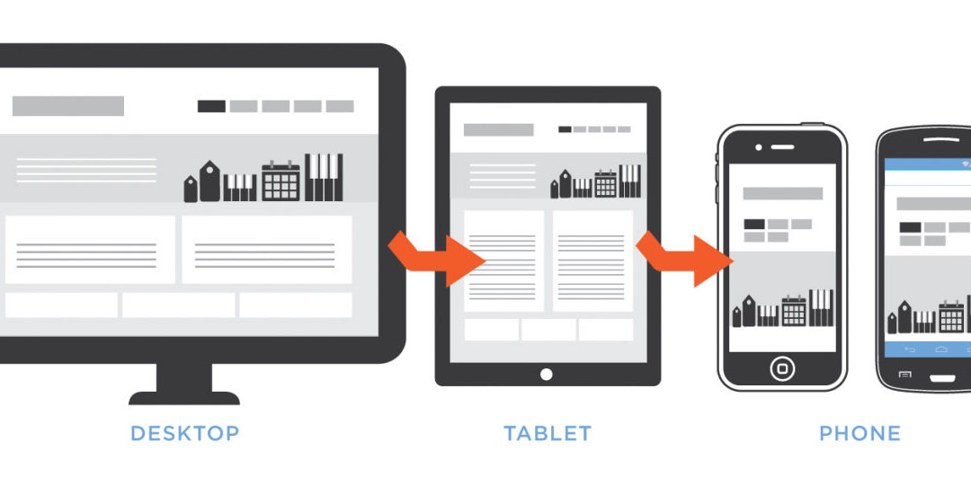
1. DESIGN A SEPARATE MOBILE SITE
If you are expecting your visitors to access the same site from both desktop and mobile browsers, you might as well be asking them to fit a square peg into a round hole. It just doesn’t work.
2. PRESENT A CLEAR LINK FROM THE FULL SITE TO THE MOBILE SITE
Make it easy for the user to self correct. Unfortunately, search engines often direct mobile users to the full sites – even for businesses that offer mobile websites with much better user experience.
3. BUILD A MOBILE APP (If Doable)
Mobile applications have a measured success rate of 76% as opposed to 64% for mobile websites. If your product or service is suited for a mobile application and can justify the expense of developing a mobile application, then building a mobile application is a good choice.
4. AVOID SWIPE AMBIGUITY
Consider the difference between mouse-driven desktop design and gesture driven touchscreen design. Desktop website design generally avoids horizontal scrolling, but for touchscreens, horizontal swipes are common place (ex. scrolling through a carousel). This gesture is less discoverable for new users than most other ways of manipulating mobile content, so it is recommended that a visial cue is presented.
5. LIMIT THE NUMBER OF FEATURES
Avoid what has come to be known as the “fat-finger syndrome”. A successful mobile website or application is designed for small screens. Sadly, some websites still expect their users to hit tiny areas that are smaller than their fingers. To make the most out of small screen size, limit the number of features on your mobile website to those that matter the most for the mobile user.